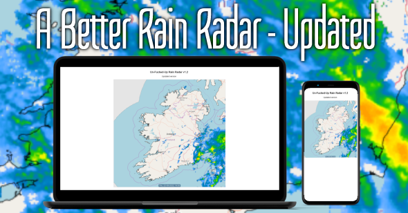
A Better Rain Radar - Updated
Technologies: REST API, AJAX, JSON, Javascript, CSS, HTML

When I made the Better Rain Radar I did so for my own personal use and I tweaked it slightly so I could have a portable version on my own mobile phone.
Since then others have started using it on their mobile phones but with inconsistent results.
It seems that some phones do not fully support CSS transforms, despite claims to the contrary.
To get around this problem I decided to deal with it by using JavaScript instead of using CSS because "transform scale" uses unitless numbers and cannot be used in conjunction with CSS "calc" which will always return a unit of some kind.
First I created a small, simple function to scale the map:
function scaleMap() {
    if ((window.innerWidth - 8) < 688) {
        var scaleRatio = (window.innerWidth - 8) / 688;
        map.style.transform = 'scale(' + scaleRatio + ')';
    }
}
So what this function does is it checks if the width of the window (minus 8 pixels) is less than the width of the map (which is 688 pixels) and when this is true it calculates the scale to use to transform the map so that it is exactly 8 pixels (4 + 4) less than the width of the screen.
It is important to note that the map had to be resized with "transform scale" as any other method would only clip the map to the size that was needed but the background images used inside it would not change to match the new size.
Next I added an even listener so the map would be scaled when the browser window would be resized:
window.addEventListener('resize', scaleMap);
This, of course, would not work on a smartphone so I added another event listener to scale the map when the page loaded:
window.addEventListener('load', scaleMap);
Lastly the page needed a couple of changes made to the CSS so it would play nicely with the JavaScript.
First I added a few rules to prevent the page from scrolling and moved the font definition from the heading to the body:
html, body {
    border:  0;
    padding: 0;
    margin:  0;
    outline: 0;
    height: 100vh;
    overflow: hidden;
    font-family: sans-serif;
}
Next the map-container needed to be updated because it had used flexbox to center the map but this did not appear to work well with the JavaScript transform so it changed from this:
#map-container {
    display: flex;
    justify-content: center;
}
To this:
#map-container {
    display: block;
    max-width: 688px;
    max-height: 688px;
    margin: 0 auto;
    padding: 0 0 0 4px;
}
None of this would have worked without the addition of one simple rule:
#map {
    display: block;
    transform-origin: top left;
    width:  688px;
    height: 688px;
    border: 1px solid #dddddd;
    background: #aad3df;
    overflow: hidden;
}
Any element which is scaled has to have a point from which all parts of it can be scaled and by default this is its own center.
So, without changing the "transform origin" the map would have scaled down in size correctly but its centre would have remained at 344 pixels from the left edge of the screen which itself might not have been more than 360 pixels wide, so as the screen (or window) became smaller and smaller, the map would have drifted to the right until very little of it was visible.
By changing its "transform origin" to the top left corner, which was attached to the top left of the map container whose size and position were defined by the size of the screen, meant the map would always be in the correct place and would be correct size.
I am planning another version which displays the 8 day rain forecast.